GroupMe Redesign
improving the user experience and design behind a highly popular communication app
Problem Space
GroupMe is a group messaging app designed for seamless communication and collaboration among teams, friends, and communities. Although a highly popular app in large communities such as universities with unique value over competitors, the user experience and design of the messaging app is poor. These widely-shared pain points call for improvements to enhance organization, customization, search functionality, and integration, ensuring a smoother and more efficient communication experience within GroupMe.
User Research
In order to develop an improved version of GroupMe, it was critical to understand the contexts and use cases of GroupMe based on their primary user audiences. The research goals were as follows:
Understand the current audience niche of GroupMe compared to other messaging apps (Slack, Microsoft Teams, Discord, etc...)
Identify how users interacted with key features of the app and how they each contribute to the larger goals of the messaging platform
Investigate pain points in the user experience
Key Research Takeaways
Highly Convenient
GroupMe benefited from its large group chat support and design decisions around supporting this target audience. Users tended to prefer using GroupMe for brief tasks that required interacting with strangers for a predefined amount of time.
Feature Bloated
Many features were thought to be useless by its users, while others were not even known. This highlights the likely approach by GroupMe to integrate as many features to capture the widest audience as possible.
Organization and Prioritzation
Users found the design of the app cluttered and confusing to navigate. Time-sensitive notifications were often buried, while notifications proved to be more of a hassle than convenience.
Mid Fidelity Wireframes
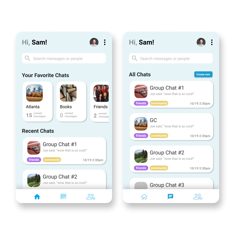
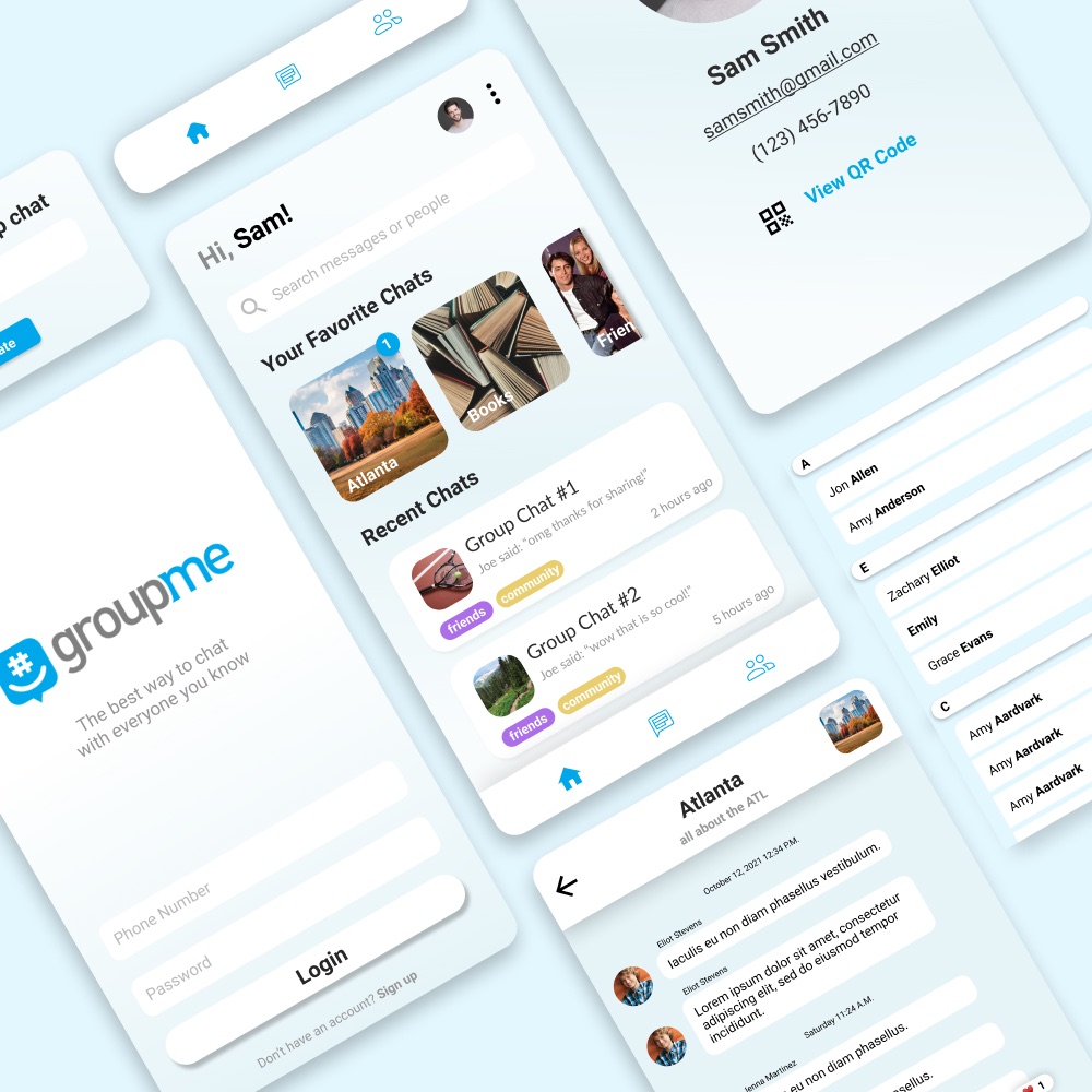
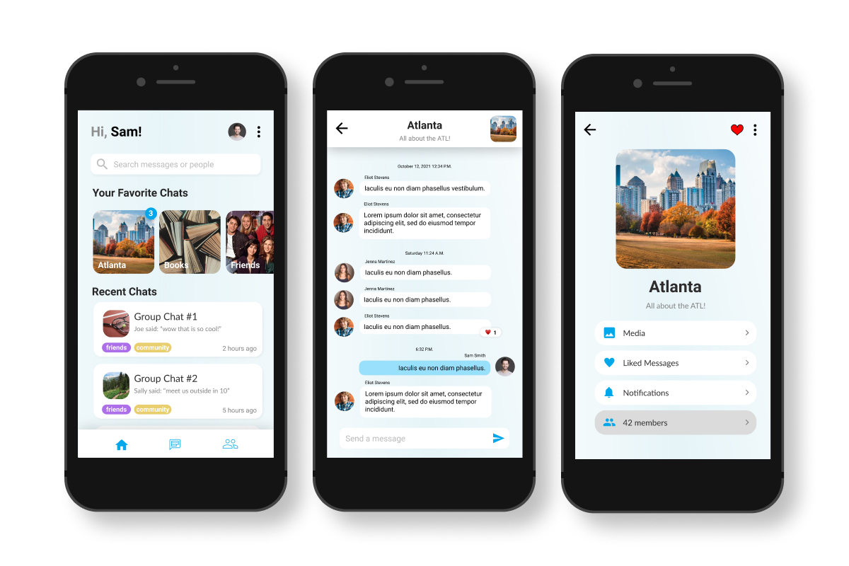
This improved on the original design by separating the original message screen into two pages - a 'Home' tab and an 'All Chats' page. The 'Home' page groups favorited chats at the top of the screen for easy access, while listing most recently accessed chats underneath. The 'All Chats' page provides a more traditional list of group chats sorted in descending order by last received message.
Overall, the design emphasizes greater negative space to reduce the sense of clutter, and bolds content that needs to be separated from the background.
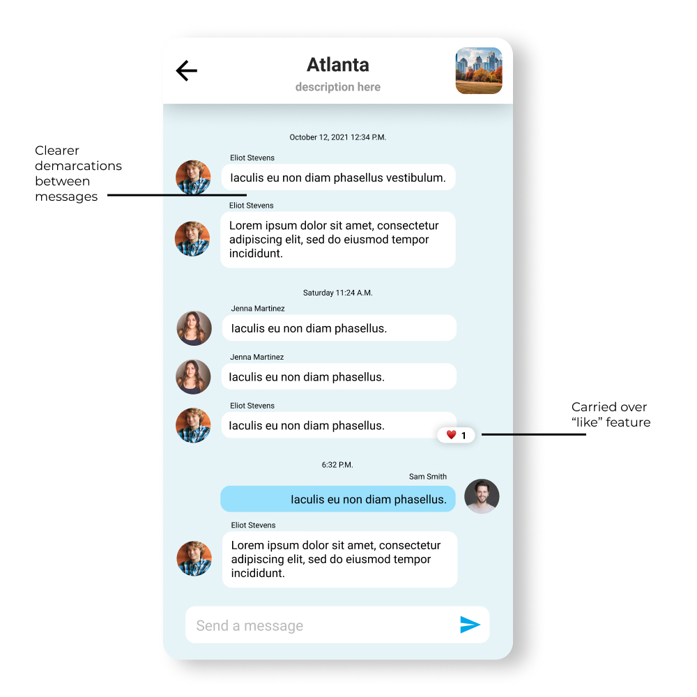
Reactions are now placed at the corner of the respective message, allowing for more variety of emotions compared to the original 'like' function. Additionally, like the home screen, increased negative space is provided to provide greater separation between components.
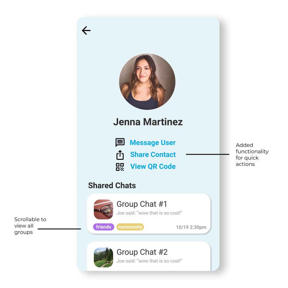
The first half of the profile page provides quick actions for the user to easily contact and/or share information. The profile page also highlights mutual group chats, which is incredibly helpful considering the primary user audience of GroupMe.
User Testing
Using Figma, user testing was conducted to observe how users navigated through our redesigned interface. Users were asked to accomplish tasks such as creating a group chat, and finding details about a group chat.
The key outcomes from the user testings are below:
Improved Navigation
Users found the new experience to be easier to navigate. Part of this improvement is the clearer definitions between on-screen elements, allowing a better sense of actionability.
Poor text and content visibility
Users noted that many images and fonts were too small and inconsistent, contributing to a feeling of clutterness.
Desire for organizational features
Users mentioned their appreciation for the grouping of group chats, but expressed desire for further organizational tools that would set this redesign apart from the original design.
Our Solution
Our redesign of the GroupMe app brings a range of enhancements aimed at delivering an exceptional user experience. With a streamlined and intuitive navigation system, users can effortlessly navigate through the app and engage in group conversations seamlessly. The organization of large group discussions has been significantly improved, allowing for better message management and reducing the risk of important information being overlooked. The introduction of a robust search feature empowers users to swiftly locate specific messages or people within the conversation history, saving valuable time and increasing productivity. These comprehensive design improvements create an elevated communication experience within GroupMe, ensuring user satisfaction and fostering effective collaboration among its diverse user base.
User Interactions and Interface Design
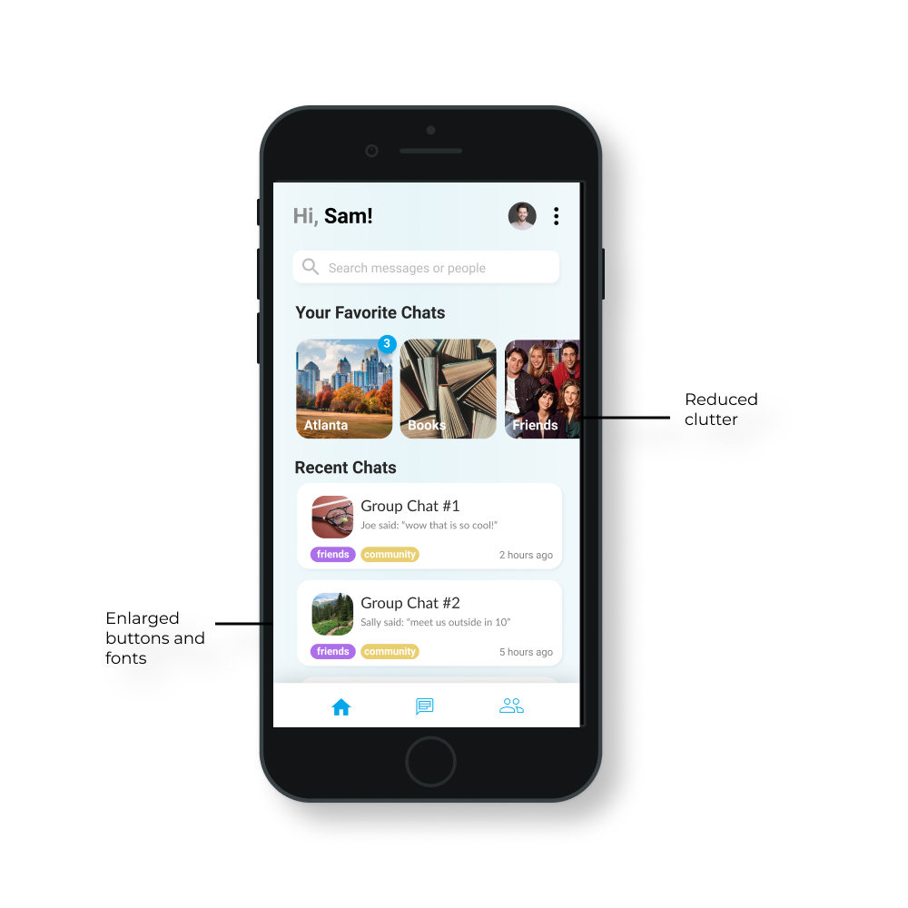
Favorite group chats are now indicated by their respective group photo, with floating bubbles indicating the number of unread messages. This design change was driven by the feedback that the group chats that users would favorite are likely to be people they are more familiar with, and need less contextual information.
Recent chats are maintained, with minor visual improvements to provide a more consistent experience.
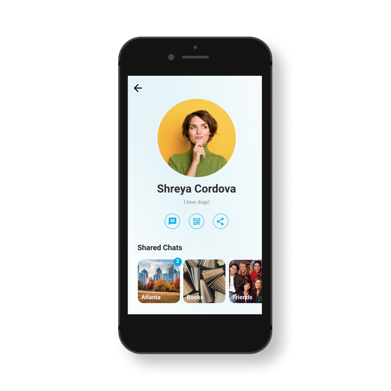
Quick actions have been simplified into icons.
Shared/mutual group chats follow a similar design principle to favorited group chats on the home screen.
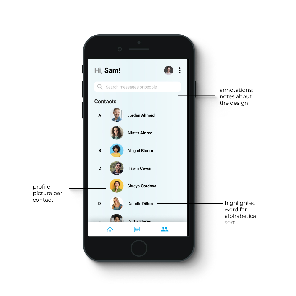
Last names are highlighted and used for alphabetical sort.
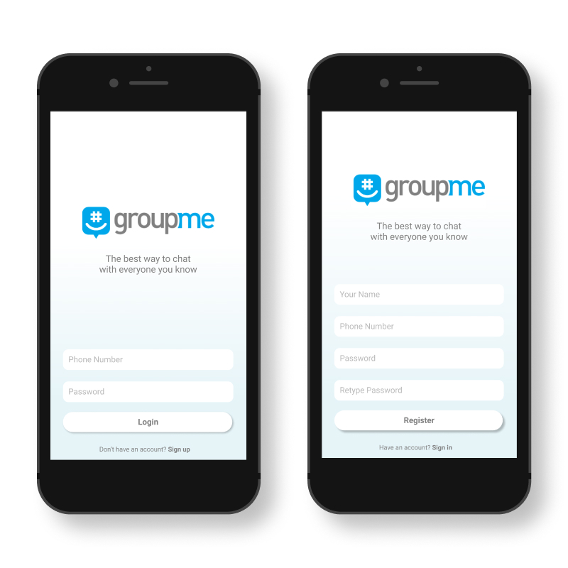
User Flow: Login Page
The login and registration pages have been overhauled with a simpler, more modern design approach. Users are presented with a user-friendly login screen, where they can easily enter their credentials or choose to register for an account.
User Flow: Group Chat Navigation
The home screen greets users with a clean and inviting interface, presenting them with relevant information and easy access to their groups. Upon selecting a group, they are smoothly transitioned into the chat messages screen, where they can effortlessly engage in conversations with other group members. The chat messages screen offers a visually appealing and organized layout, ensuring clear message threads and easy navigation. Users can swiftly scroll through conversations, reply to messages, and access essential features with just a few taps. When users need additional context or information about the group chat, they can seamlessly navigate to the info screen. This screen provides a comprehensive overview of the group, including member details, liked messages, and other relevant information.
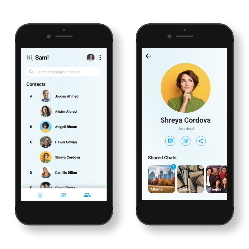
User Flow: Contact Finding
This user flow begins with a user-friendly contact list screen, providing users with a comprehensive view of their contacts. The contact list screen displays a visually appealing layout, allowing users to quickly scan through their contacts and find the person they want to connect with. Upon selecting a specific contact, users are seamlessly transitioned to the contact details screen, where they can access relevant information about the person. This screen provides a clear and organized presentation of the contact's details, including their name, profile picture, and additional information. Users can easily initiate communication, view shared content, or access any available actions related to the contact.
Reflection
The design process for addressing the pain points in the GroupMe app involved thorough research, iterative design iterations, user feedback, stakeholder collaboration, and a focus on simplicity, customization, and integration. By studying user needs and pain points, valuable insights were gathered to inform design decisions. Multiple design iterations and prototypes were created and tested with users, resulting in continuous refinement of the user experience. Collaboration with stakeholders ensured feasibility and practicality of proposed solutions. The final solution is a redesigned GroupMe app that streamlines organization, enhances customization options, improves search functionality, and facilitates seamless integration with productivity tools. This iterative and user-centered approach led to an improved app that addresses user needs and delivers an intuitive and efficient communication platform.
Next Steps

Learning Outcomes
User-Centered Design Approach
Through this project, I embraced a user-centered design approach, prioritizing user needs and incorporating user feedback throughout the design process. This was made possible by conducting thorough research, user testing, and iterative design iterations. This learning outcome has significantly improved my ability to focus on empathy, usability, and creating meaningful experiences for users, enhancing the effectiveness and impact of my design solutions, consequently resulting in more user-centric and successful designs.
Feedback and Iteration
This project required engaging in continuous feedback and iteration cycles in order to create a well-designed solution. By actively seeking feedback from users, stakeholders, and design peers, and iterating on the design based on their input, I recognized the value of incorporating diverse perspectives and refining designs over time.
Design Interfaces
Recognizing the importance of design aesthetics and visual appeal in creating engaging and delightful user experiences was really important in this project. Explored various design principles, color schemes, typography, and layout options was really fun and impactful to my learning.
You've reached the end!
Feel free to explore my other projects!